
S&P 500 Long Term Trading Model - RTO
Using capital flows to predict long term bull and bear markets

The ideal base for a trading model is a tool to identify the long-term bullish / bearish trend while avoiding noise (signals that whipsaw you in and out of the market). From this base, more nimble and sophisticated strategies can be built. The best model will struggle to make money taking short positions in a bull market and vice versa.
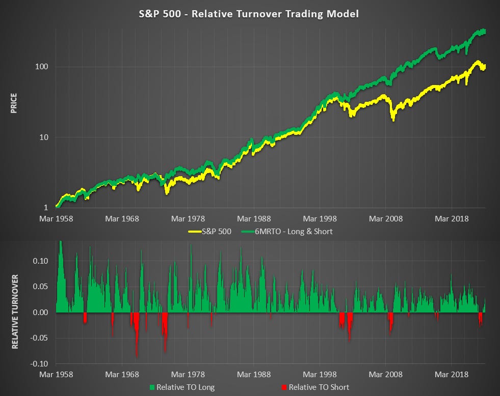
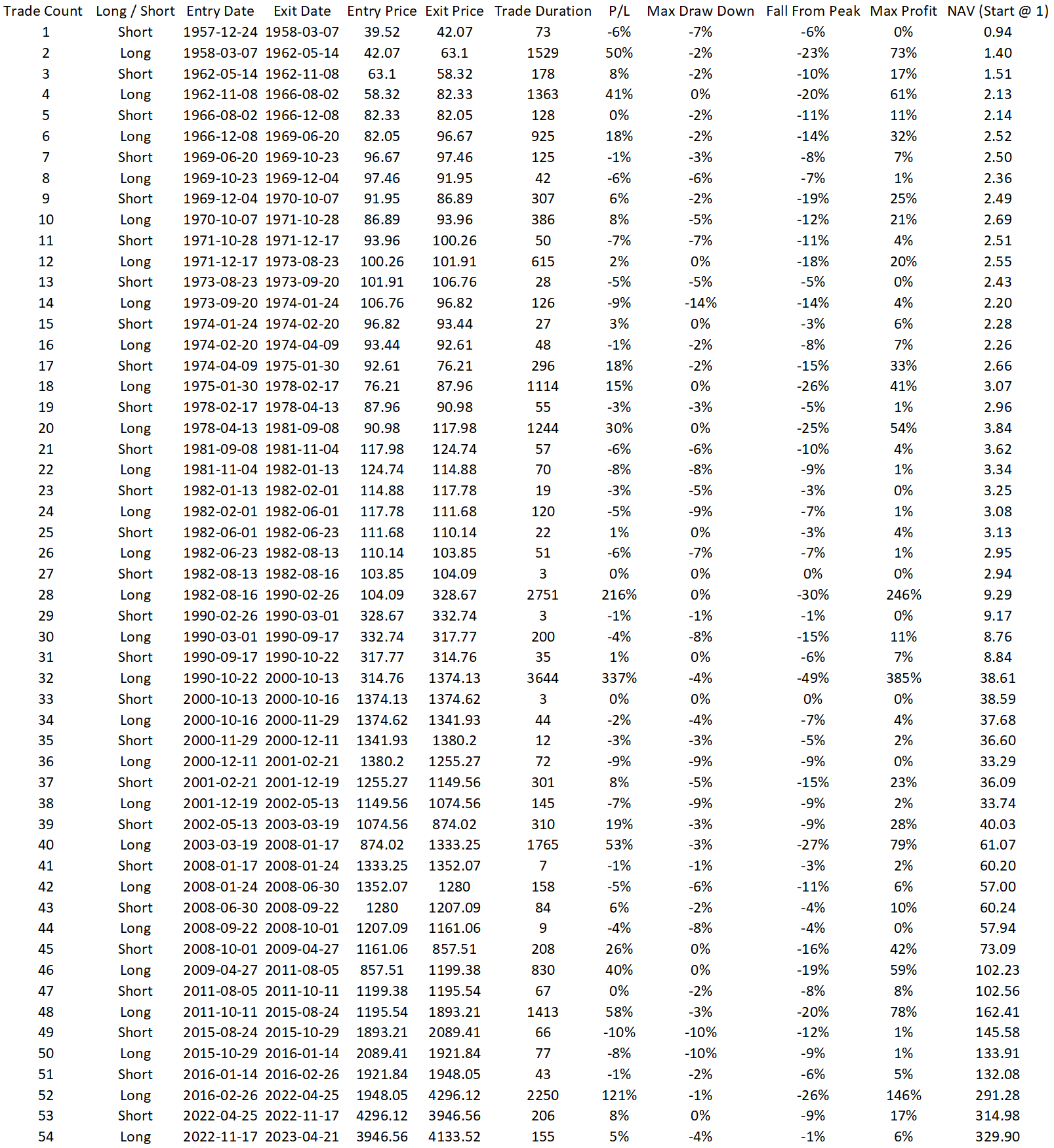
Using capital flows I was able to break the last 65 years of the S&P 500 into just 54 periods, successfully shorting (or avoiding) all of the long-term bear markets without sacrificing any of the major bull markets. As you can see from the chart below, the results are remarkable for a model that changes positions so infrequently.
So how does it actually work?
Building on the foundations from previous posts:


Turnover = Tick Price * Volume. A measure of the velocity of money flowing through the market.
After assessing the evolution of Turnover, the next step was to look at the relationship between Turnover (TO) from stocks that are advancing (Up TO) vs Turnover from stocks that are declining (Down TO).
We know that Turnover has gone through periods of extremely rapid expansion. TO growth has been 38,200% since 1957 compared to ‘just’ 8,670% for the S&P 500. To normalize the turnover I used the daily relative percentage over the prior month.
This was done by taking the average Up TO over the last month as a ratio of the average directional* TO from the last month. When this ratio is over 50% then there has been more Up TO than Down TO. Logic would say this is bullish. We will call this Relative TO (RTO).
I then took the 6-month average of the RTO (6MRTO) to reveal if, over the previous 6 months, the balance of capital flows has been positive or negative. To make this clear on a chart, I subtracted 0.5 to convert it to a histogram that pivots from bullish (>0) to bearish (<0)^.
Model Results
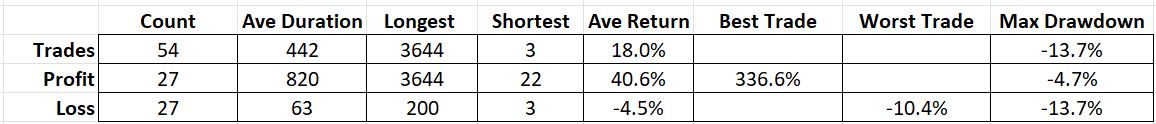
There were 27 winning trades and 27 losing trades however the average win was 40.6% vs the average loss of -4.5% while the largest drawdown was only 13.7%. Here is a more detailed look at how it traded through each market cycle.
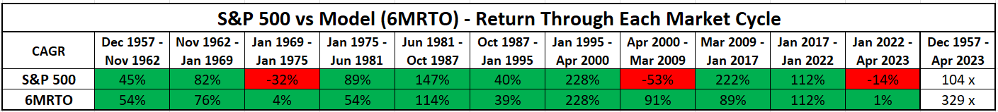
(Above) Note that RTO was profitable through every market cycle while a buy-and-hold approach saw three cycles with a drawdown.
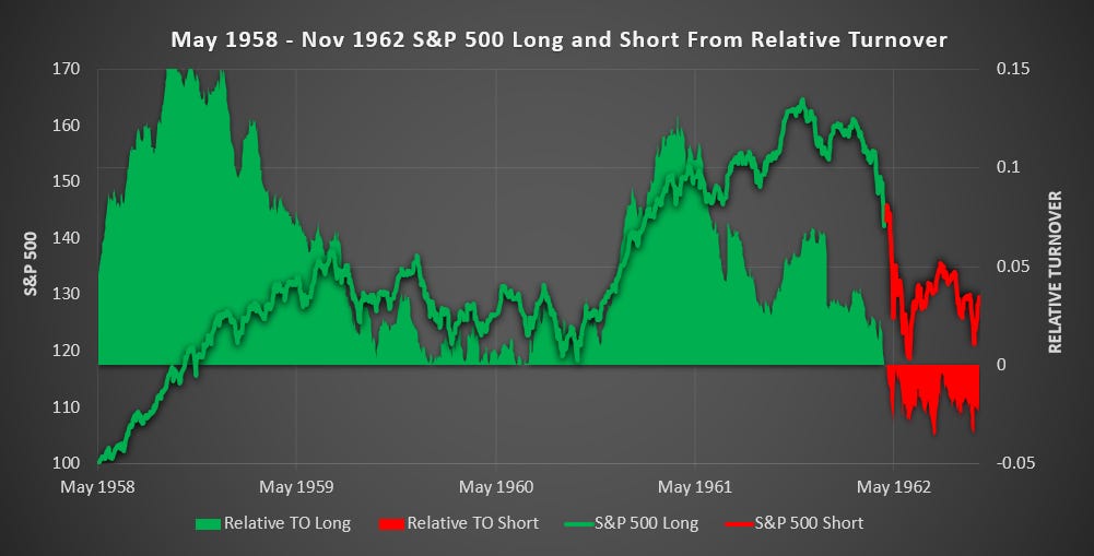
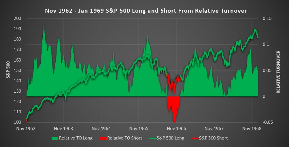
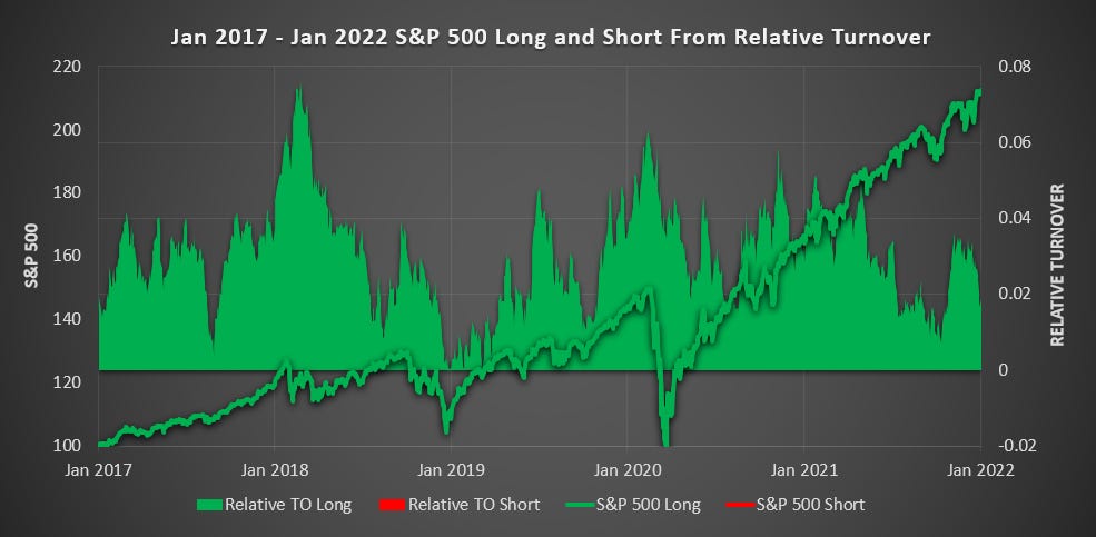
(Above) You start to get a feel for how RTO’s unique ability to hold onto positions through multiple years despite uninspiring price action and then switch to avoid the worst declines. This kind of patience pays off.
(Above) RTO successfully held onto positions through the best of the bull market.
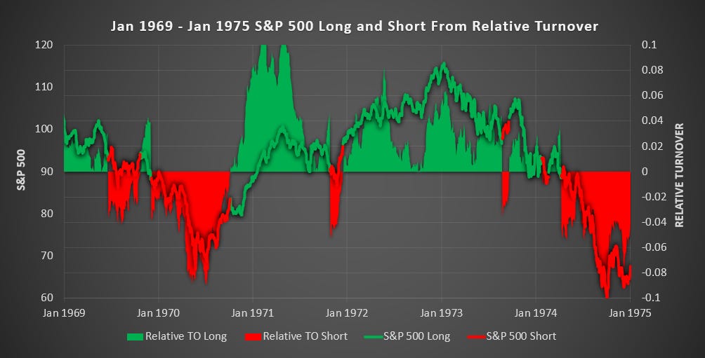
(Above) Through an exceedingly challenging market, RTO avoided the worst of the bear market returning 4% vs -31% for buy and hold.
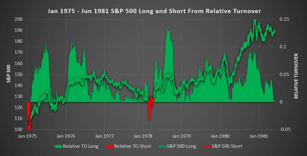
(Above) Except for a small false signal in 1978, RTO correctly picked the long-term bullish trend.
(Above) RTO continued to hold through the bull market.
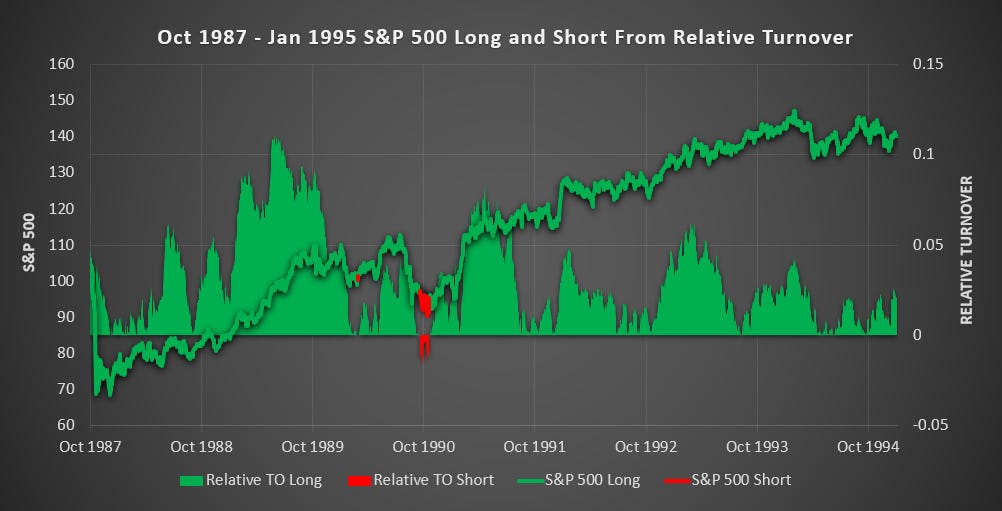
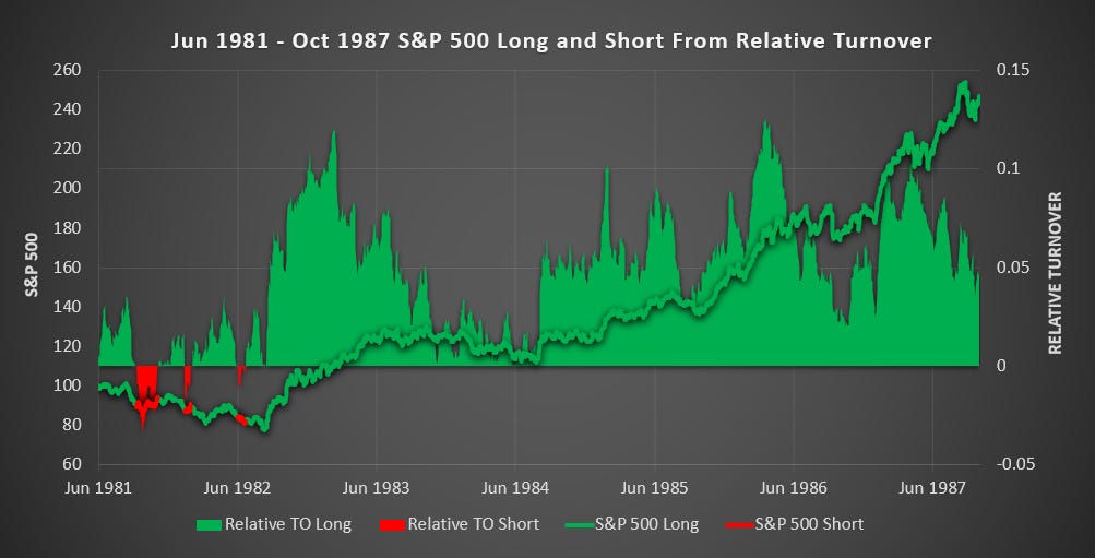
(Above) RTO held right through the 1987 crash and through the recovery that followed. Clearly, this is a long-term model and won’t protect you from sudden reversals. But those that held after the 87 crash were quickly rewarded.
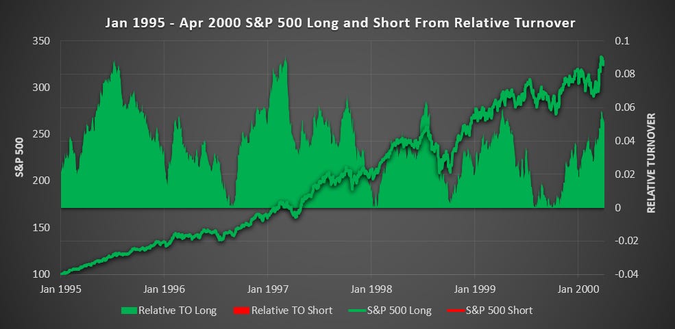
(Above) RTO successfully held through the dot-com boom.
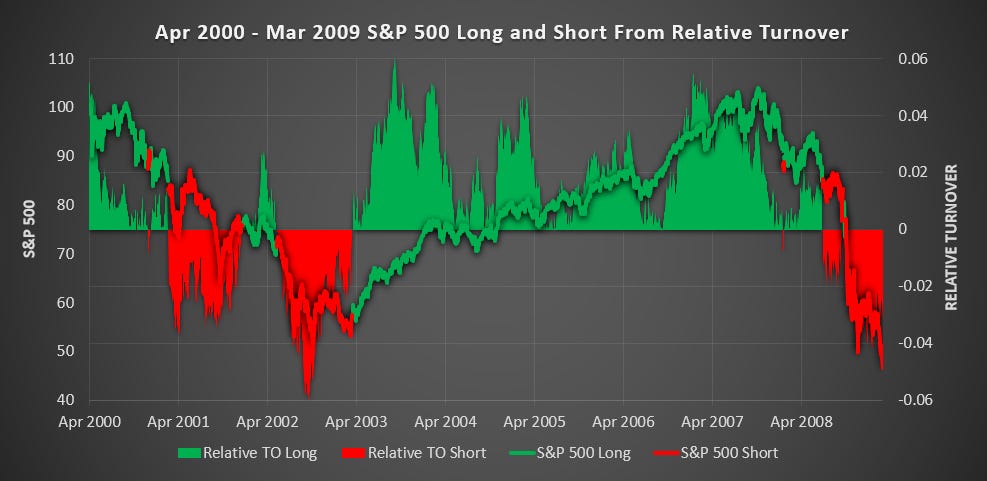
(Above) RTO avoided the worst of the bear market while still capturing huge upside returning 91% vs -53 for buy and hold. It is during periods like this when using RTO offers far superior returns.
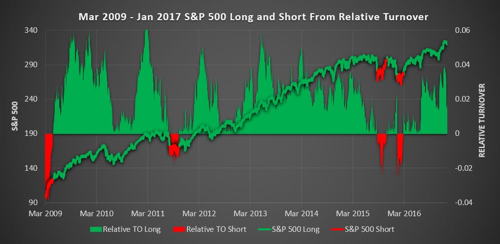
(Above) RTO got caught in some noise during late 2015 and early 2016 but otherwise captured the bull market nicely.
(Above) It is very encouraging to see Relative Turnover holding through the Covid crash of 2020 and enjoying the bull market that followed. Any typical long-term trading model would have exited you in the crash and missed most of the recovery.
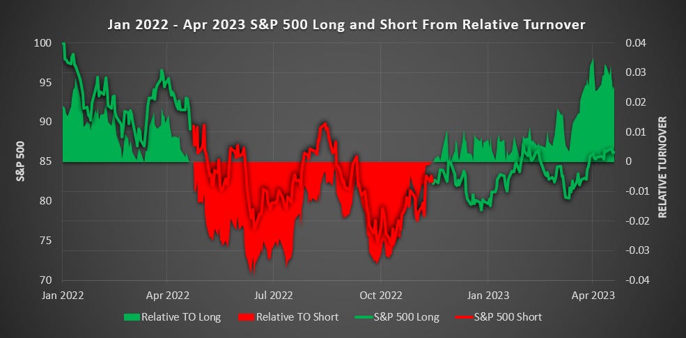
(Above) The reason that this chart stops in April 2023 is because that is when I last ran the calculations required for this model. I’ll hard code this to update in real-time later this year (2024) but don’t want to be distracted from my other research for now and the work involved is huge. It will be interesting to see if RTO correctly held through the bull market of 2023.
Here is a list of every trade:
Using the RTO Model on Sectors
Seeing this performance on the S&P 500 I was excited to extend the test to individual sectors. However, in doing so the noise and volatility was astronomical.
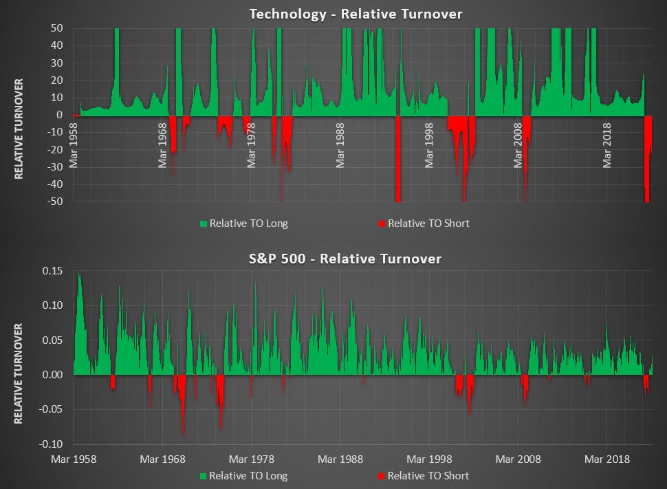
(Above) Here is the RTO for the Technology Sector and the S&P 500. Notice the scales of 0.15 to -0.10 for the S&P 500 and 50 to -50 for Technology (and the data still getting truncated). The S&P Technology sector has contained as few as 18 to as many as 83 stocks over the last 66 years. Additions, removals, and volatility in individual stocks cause distortions in the relative turnover and the outcome is nonsensical.
The alpha from RTO comes through assessing broad market capital flows so this particular method of using Turnover isn’t suitable for individual sectors. But there are many ways to skin a cat.
Conclusion
Of all the trading models I have built over the years, there has never been one that has been able to avoid market noise and hold onto long-term profitable positions to the extent that RTO does. There is clearly alpha to be found in tracking the balance of capital flows.
What would you like to see tested?
Foot Notes
I have not allowed for transaction fees or slippage. However, dividends have also not been included and the trade frequency is extremely low.
*The reason that I used directional turnover instead of just all Turnover is because ~8% of the daily Turnover for the S&P 500 before 1996 was from stocks that didn’t see their price change on the day. Read more here.
^To remove some of the noise I restricted all long signals to a minimum of 5 trading days and implemented a 5% trailing stop to close a long once the signal turned bearish. This reduced the number of signals from 225 to 54 and increased the average trade duration from 106 days to 442 while improving profitability.
Interesting work. Are you using Python? How did you manage to get a hold of the data without survivorship bias?