
S&P 500 Stock Correlation
A quantitive measure of capitulation and warning of market turning points

Read Part 1 for a primer.

Part 2:
While researching the correlation of stocks in the S&P 500 I was expecting to see correlations far higher today than they were in the past. An increase makes logical sense due to the proliferation of ETFs and index funds. What I found was the opposite.
However, to my further surprise, Correlations offer a quantitative measure of capitulation. I will provide examples through the charts below.
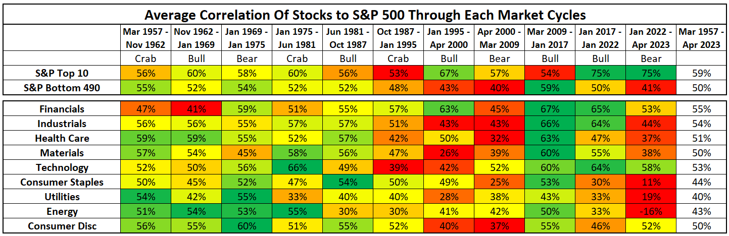
(Above) I have split the stocks in the S&P 500 by sector and also separated the Top 10 and bottom 490. The first observation is that correlation in the bottom 490 was extremely high during the 2009-2017 bull market but is currently fairly low. Conversely, correlation in the top 10 is currently extremely high. This makes sense due to the concentration of a few large stocks at the top.
Also, correlation during the Dot Com boom and the Dot Com bust was very low. The boom and the bust were both mostly led by Technology, Telecommunications & Financials while other sectors were quite mixed.
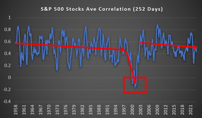
(Above) This is the average correlation for the S&P 500 and as you can see it has been in a gradual downtrend since 2003. Before 2000, correlations would routinely spike over 0.8, but those levels are rare these days.
Also, in the last 65 years, the only period to see negative correlations was 2000-2001. Such a market dislocation is an extreme abnormality.
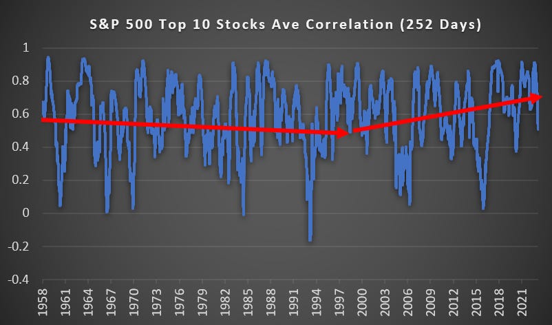
(Above) Looking at just the Top 10 stocks you see they follow a very different pattern. Correlations among the top 10 are rising and readings below 0.4 are now far less common.
Stock Correlation to S&P 500 Through Each Cycle
Through each cycle I have plotted the median, upper, and lower quartile of stock correlation to the S&P 500. Take the time to deeply observe these charts and you will notice that market turning points coincide with extreme high and low correlation levels.
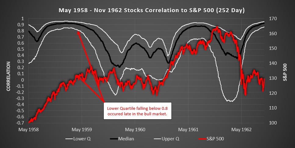
(Above) It is fascinating to see the Correlation Crush into a very narrow yet high band in the late 50s and again in the early 60s. When the lower quartile fell below 0.8 in 1959 this marked the start of a 1.5 year crab market.
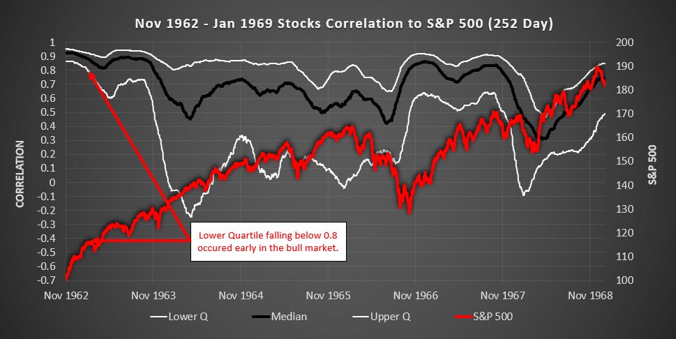
(Above) When the lower quartile fell below 0.8 in early 1963, this ushered in a bull market that lasted for the next 3 years.
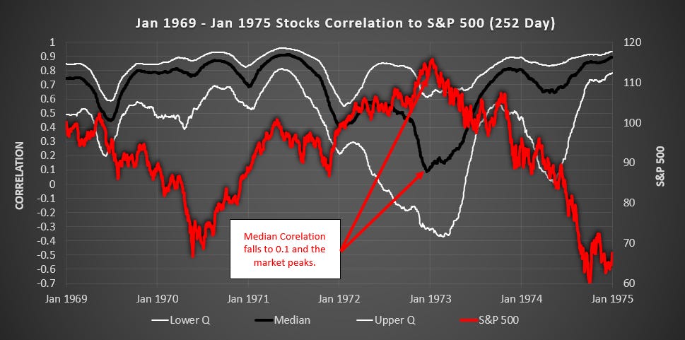
(Above) When the Median Correlation fell to 0.1 the market peaked.
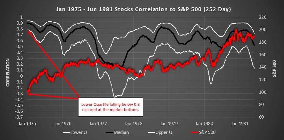
(Above) When the Lower Quartile fell below 0.8 the market bottomed.
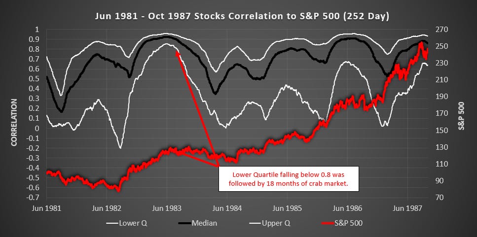
(Above) When the Lower Quartile fell below 0.8 we entered a crab market for 1.5 years.
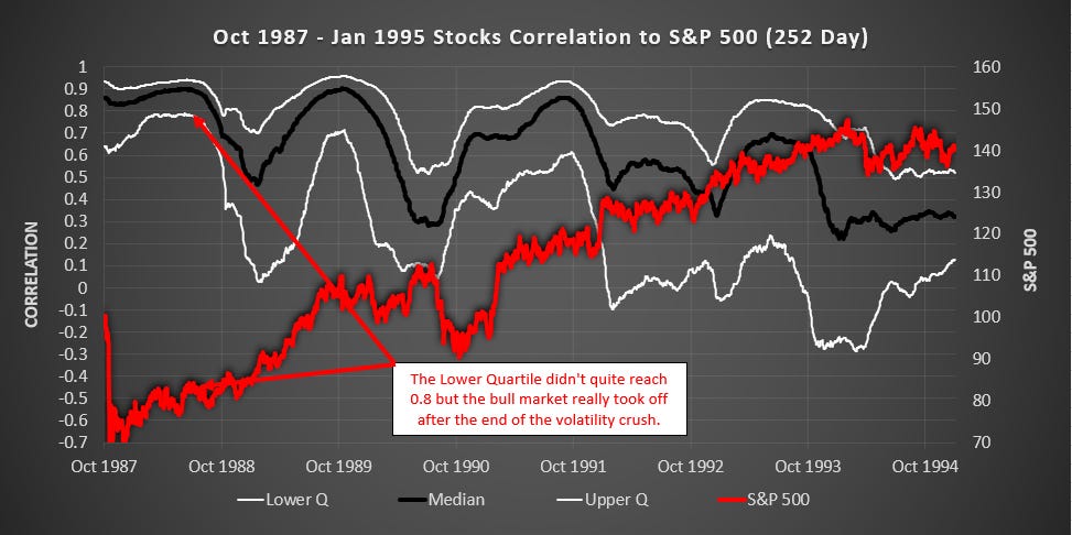
(Above) The Lower Quartile never quite reached 0.8 but when the volatility crush ended the market took off. Also in late 1989 when The Lower Quartile fell below 0.7 the market went sideways and down for the next 12 months.
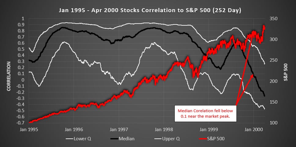
(Above) When the Median Correlation fell below 0.1 the market soon peaked.
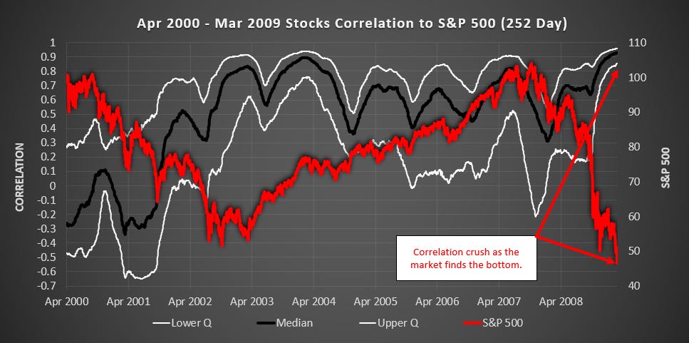
(Above) Correlation crushed into a very tight band as the market was finding the bottom. Also in April 2004 when the Lower Quartile fell below 0.7, the market went sideways for 6 months.
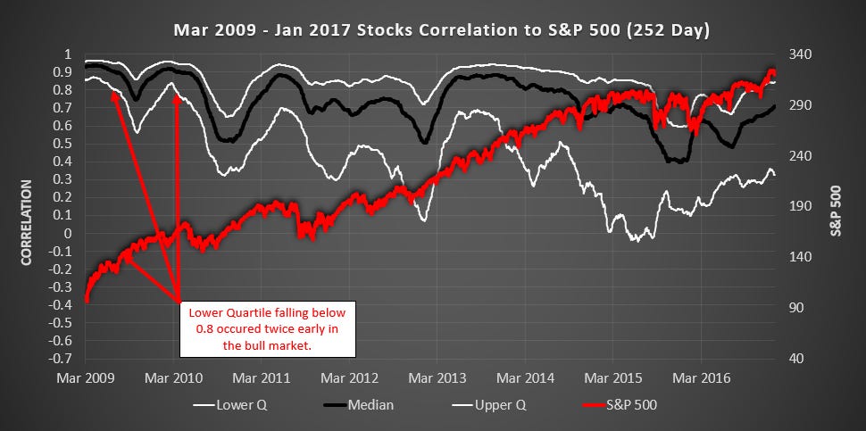
(Above) The Lower Quartile fell below 0.8 twice, early in the bull market.
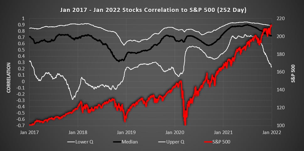
(Above) There was a bit of a volatility crush in late 2021 although the Lower Quartile only peaked around 0.7. The S&P 500 peaked in Jan 2022.
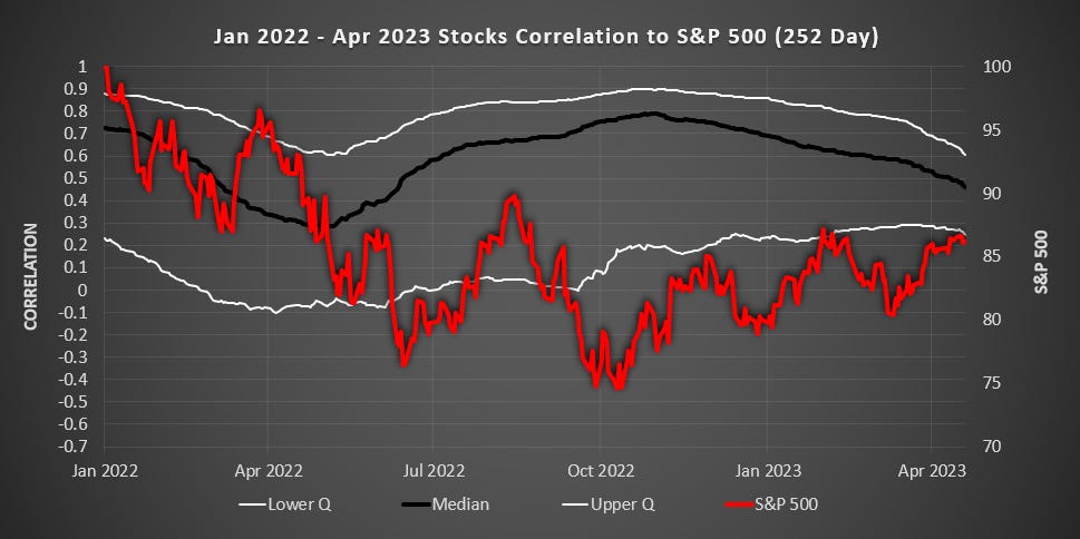
(Above) This is just a partial cycle at the end of my dataset. There are no extreme readings of note.
Conclusion
Correlation is a powerful tool for identifying times when the market moves detach from fundamentals.
If all stocks are going down thus causing a Correlation Crush above 0.8, when the crush begins to dissipate, a strong bullish period is likely to follow. This is a quantitive measure of capitulation.
If all stocks are going up thus causing a Correlation Crush above 0.8, when the crush begins to dissipate, a crab or bearish period is likely to follow.
If we are in a bull market and the median correlation falls below 0.1 then it is time to hedge your downside as the rally is no longer broad-based.