
Harmonic Shoal Trading Model
A Groundbreaking Method to Quantify Bull Market Harmony and Bear Market Anarchy

In bull markets, stocks exhibit harmonious, coordinated movements like a school of fish swimming undisturbed. While their glide path is unknown, their next move still falls within a distribution of likely outcomes skewed by the momentum of their current trajectory. This synchronicity reflects a degree of order and predictability.
However, just as a school of fish will descend into chaos when threatened by a predator, so too will markets devolve into behavior that breaks financial models. When fear enters the equation, distortions occur leading to outcomes that may be several sigma from the mean. Predictive models falter in this state of anarchy and uncertainty becomes the only constant.
In the ocean you don't need to see a predator to know it's there; the chaotic movements of the fish contain a signature that reveals the presence of danger. The stock market is no different.
In this article, I will delve into how the interrelationship of stock movements in bull and bear markets contains a quantifiable signature that reveals risk. By understanding these dynamics, we can participate in the tranquility of bull markets while avoiding the chaos of bear markets.
At the end of this article, I’ll show you how to avoid the most high-risk periods so jump to the end if you aren’t interested in the details.
Teaser: During a quantifiable 13.8% of the time 64% of the 4 Sigma down days occur.
For those who are interested, let’s first look back at the 4 main bear markets of the last 60 years to understand their internal structure. Each is linked to their Wikipedia page below if you want more historical context:
Stages of A Market Cycle
A bull market consists of peaked distributions while a bear market has collapsed distributions. What does that mean? I go into a lot of detail here but this is the TLDR primer:
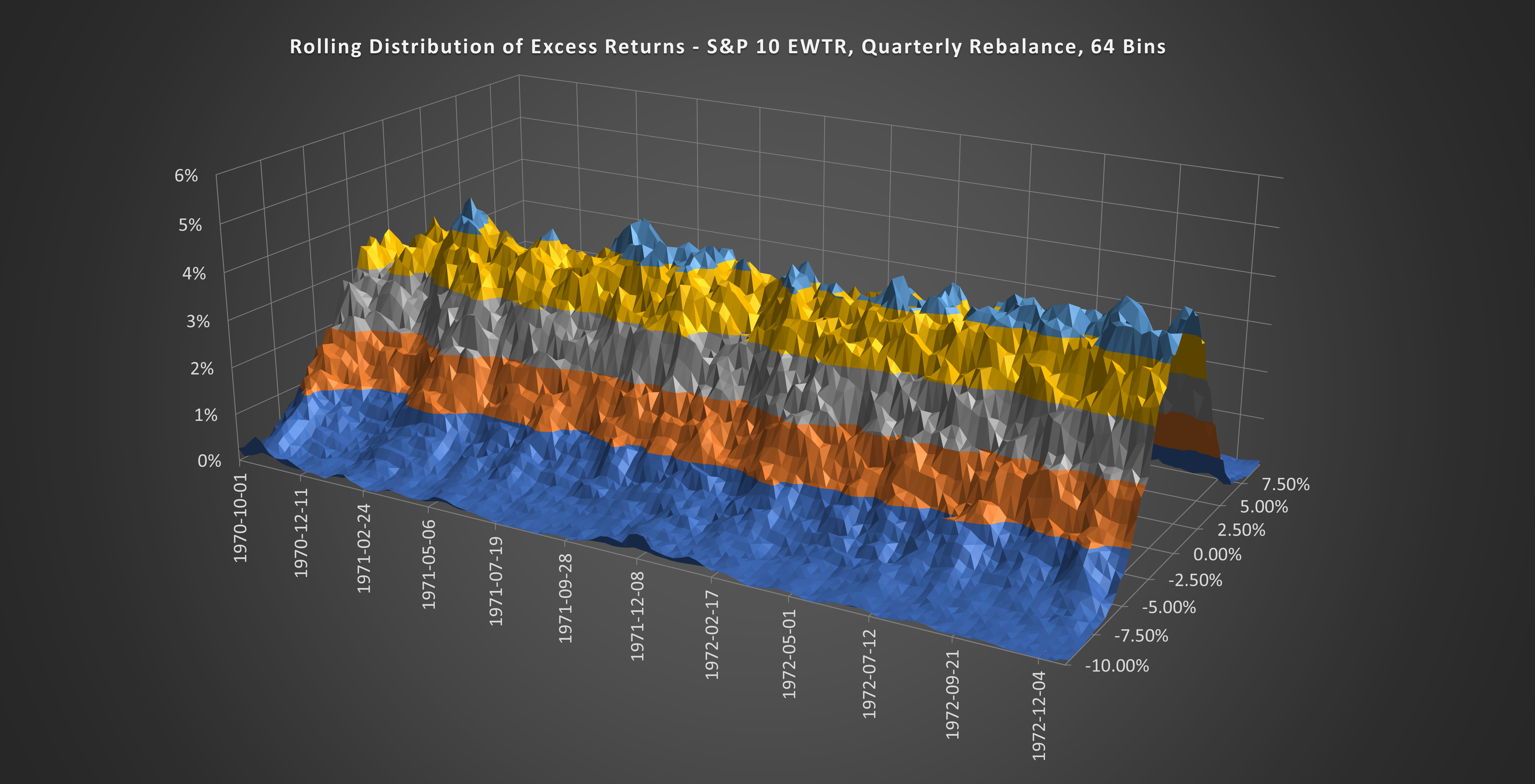
50% of the stocks in the Equal Weight S&P 500 will outperform the index and 50% will underperform the index. The distribution of outcomes follows something that looks like a Normal Distribution curve but with a higher peak and fat tails (Leptokurtic).
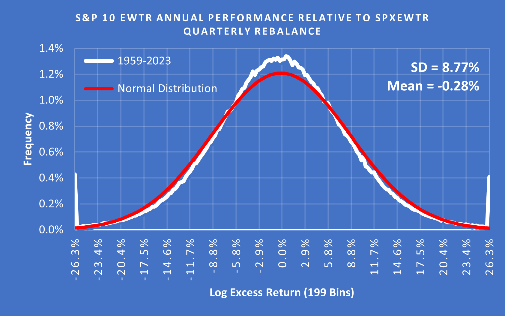
(Above) Here is the distribution of outcomes for 1000 randomly generated 10 stock portfolios, rebalanced, and 10 new stocks selected from the S&P 500 every quarter 1959-2023. The readings are relative to the S&P 500 Equal Weight Total Return Index.
During a Bull Market, you get the high peak without the fat tails. During a Bear Market, the peak collapses and the fat tails become extreme. Let me show you what I mean…
Credit Boom and GFC
Credit Boom (Pre GFC) Expansion = Bull Market
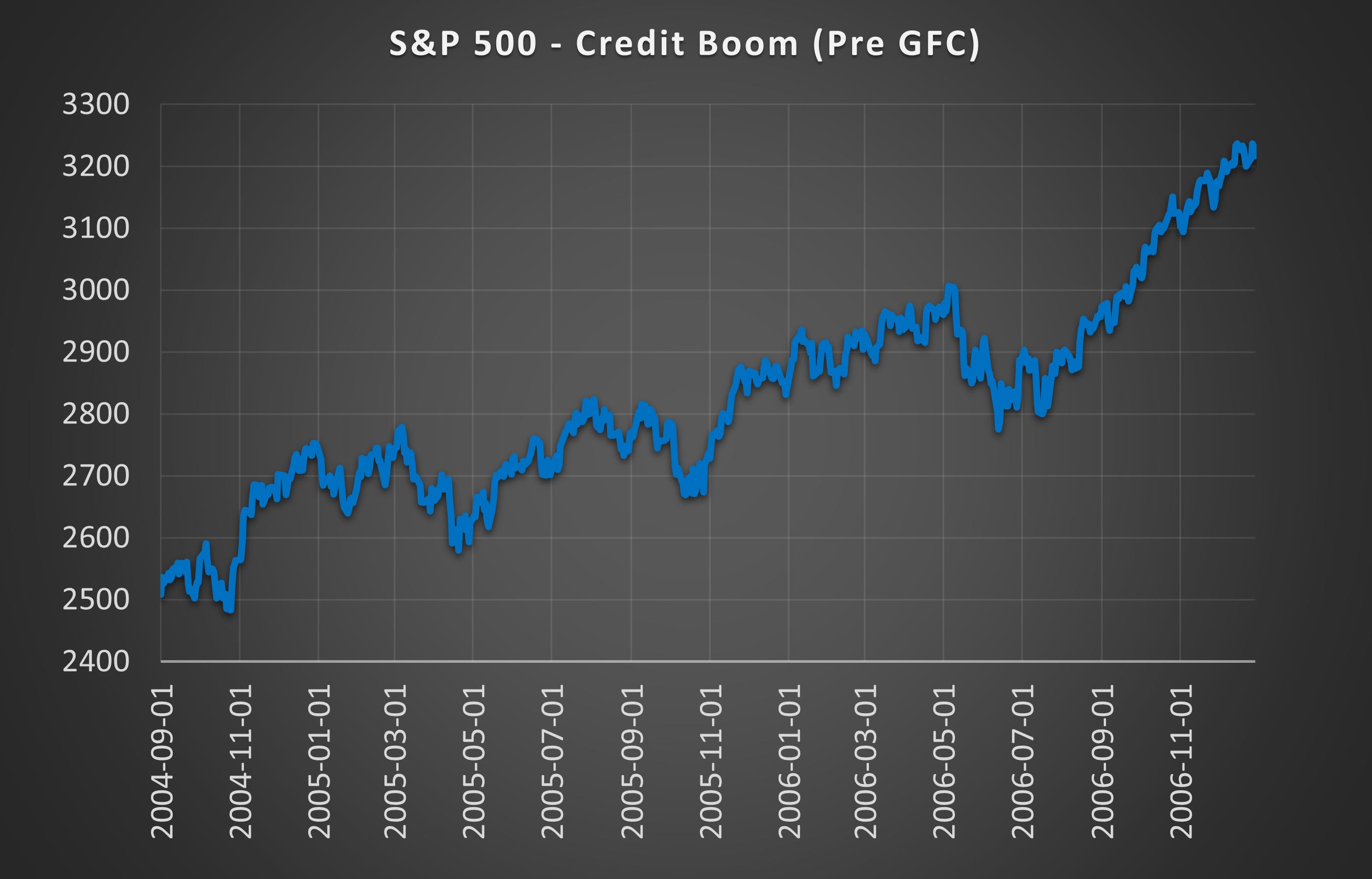
(Above) This is the final stage of the credit boom leading up to the GFC. There were several pullbacks in the price action but they all recovered.
Credit Boom (Pre GFC) Expansion = Peaked Distributions
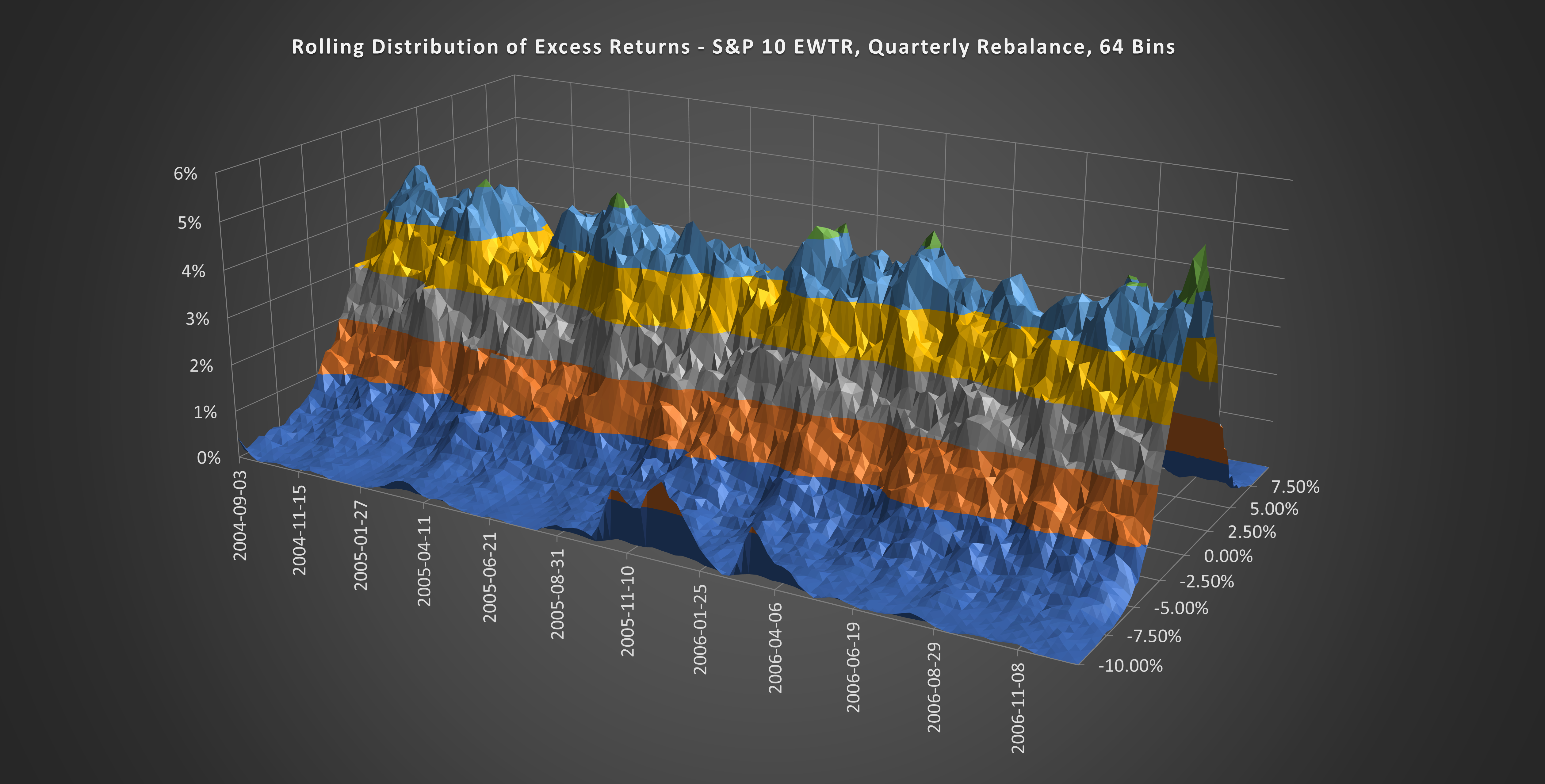
(Above) This is a 3D version of the outcome distribution that shows how it evolves through time. Notice how the distribution peak remains above 4% most of the time.
GFC Crash = Bear Market
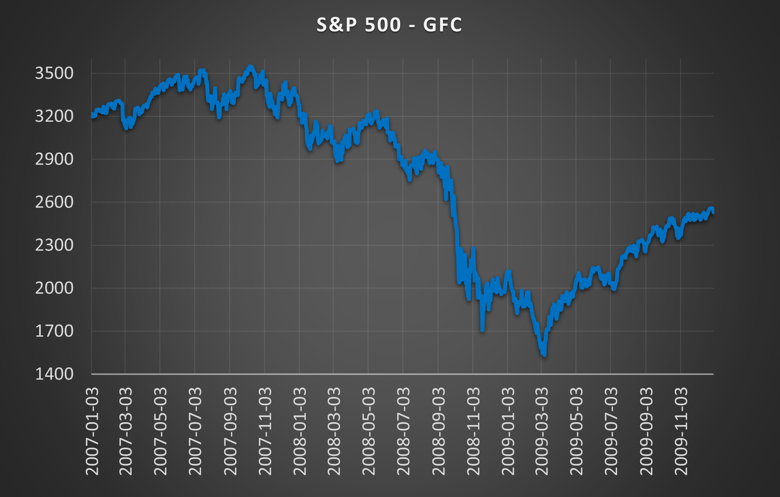
(Above) Here is the gradual breakdown in price action followed by the violent GFC crash in September 2008. While the price action struggled in 2007 there was no obvious difference to the several dips that occurred through 2005 and 2006.
GFC Crash = Collapsed Distributions
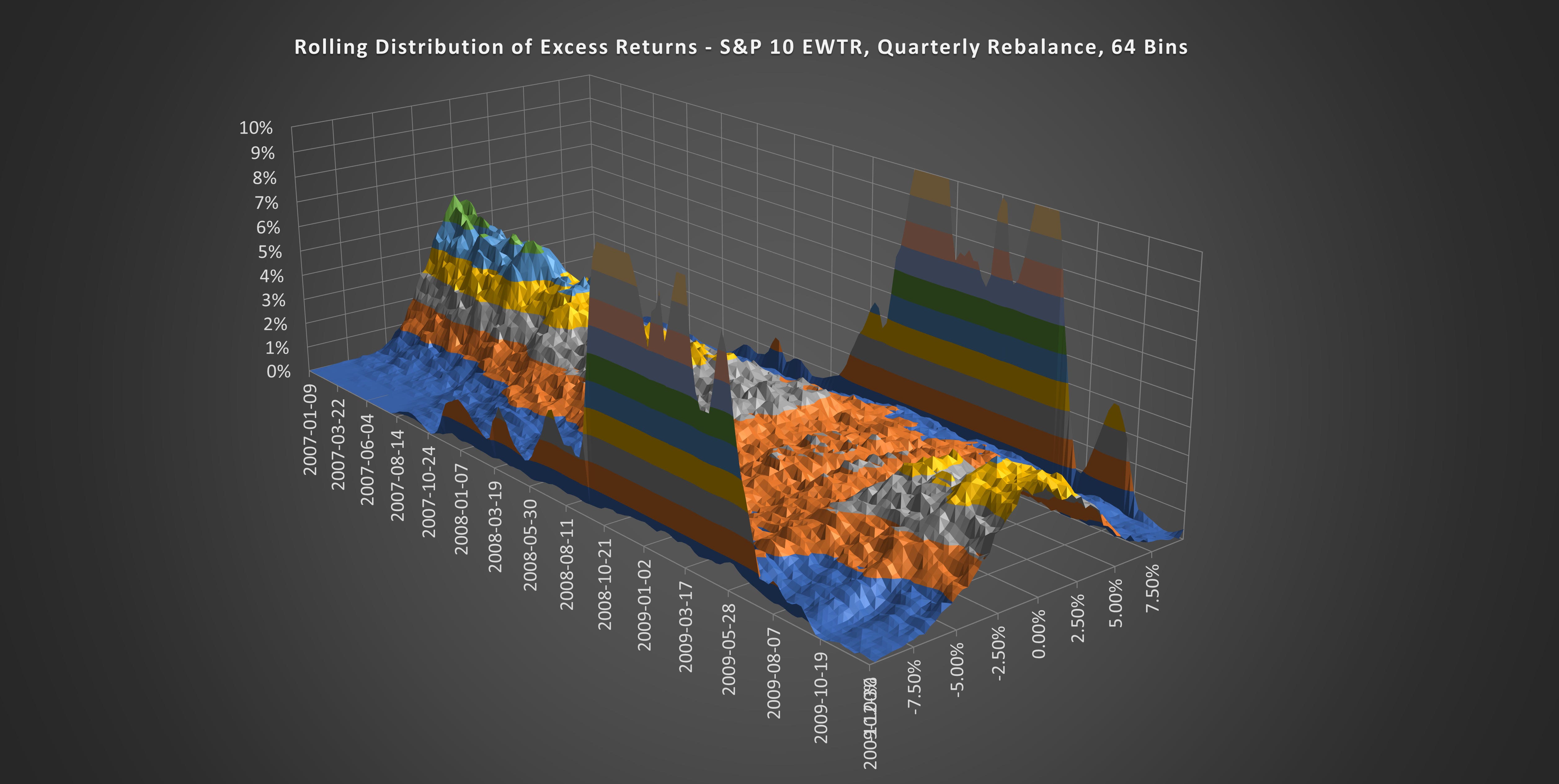
(Above) Although the price action in 2007 looked benign, the outcome distributions began to collapse in Q4 2007. Can you see the stark difference between the two market phases?
Dot-Com Bubble
Dot-Com Expansion = Bull Market
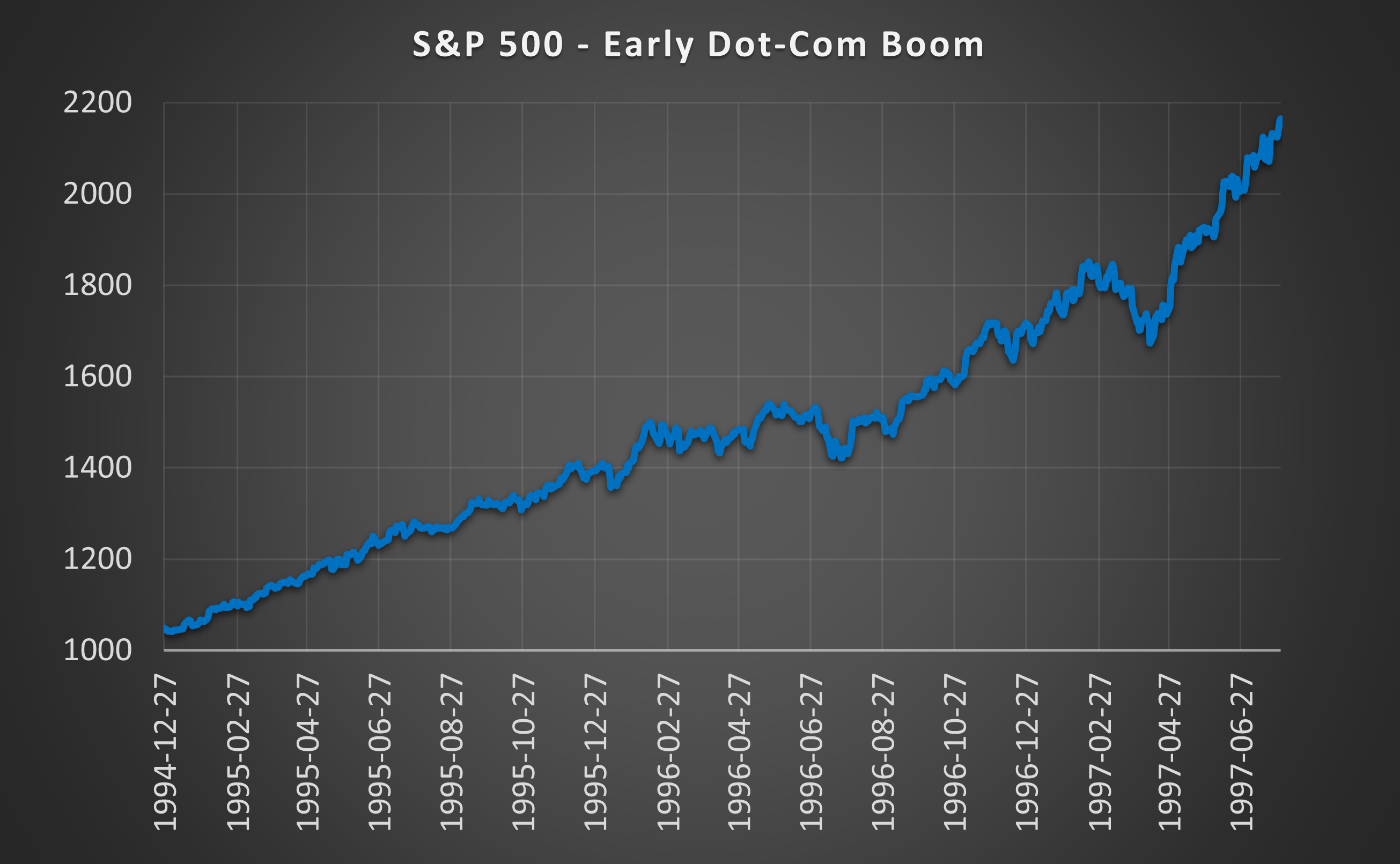
(Above) One of the most incredible bull markets in history. Everyone was an investing genius.
Dot-Com Expansion = Peaked Distributions
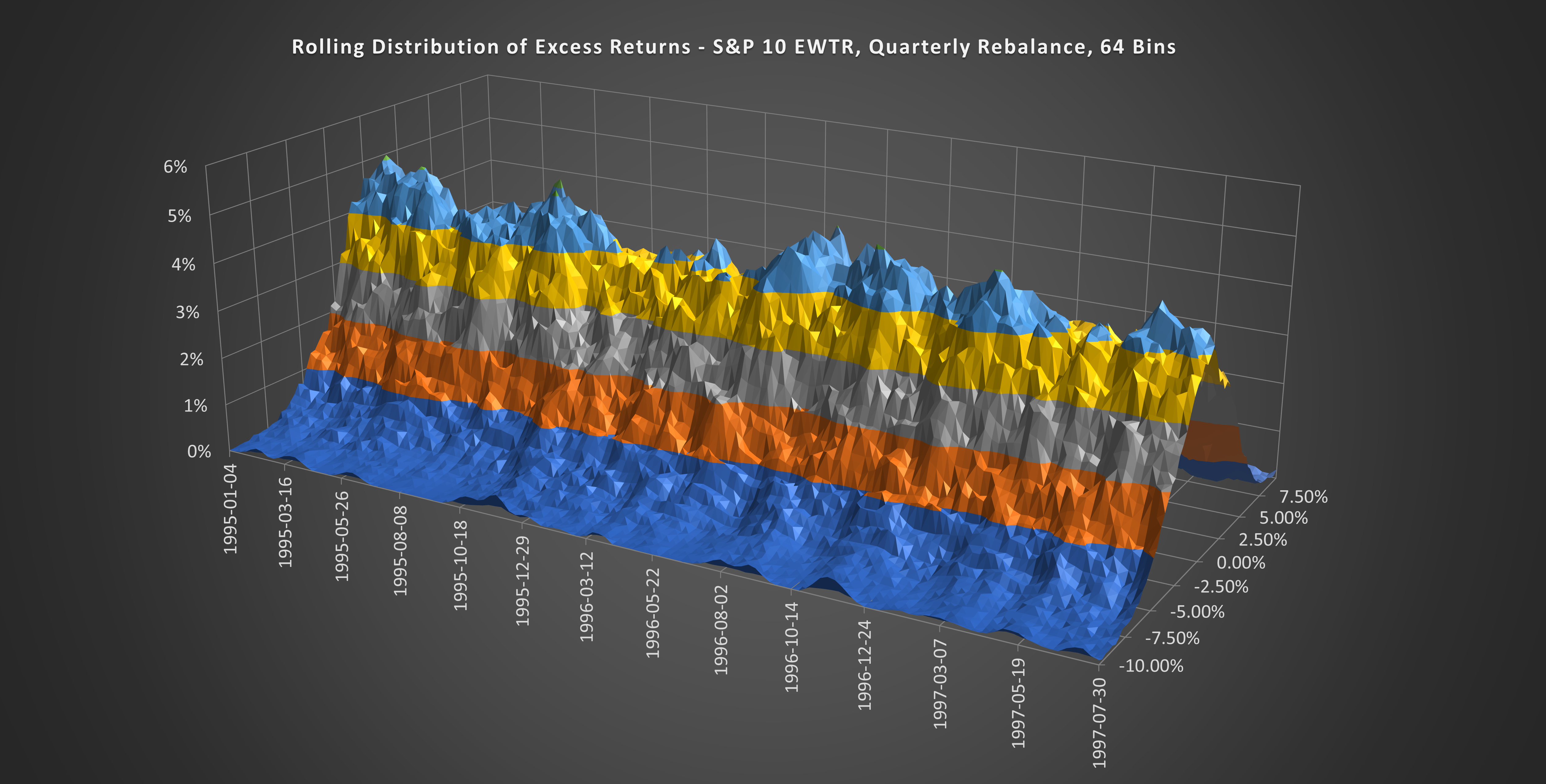
(Above) Most of the bull market saw a distribution peak above 4%.
Dot-Com Bust = Bear Market
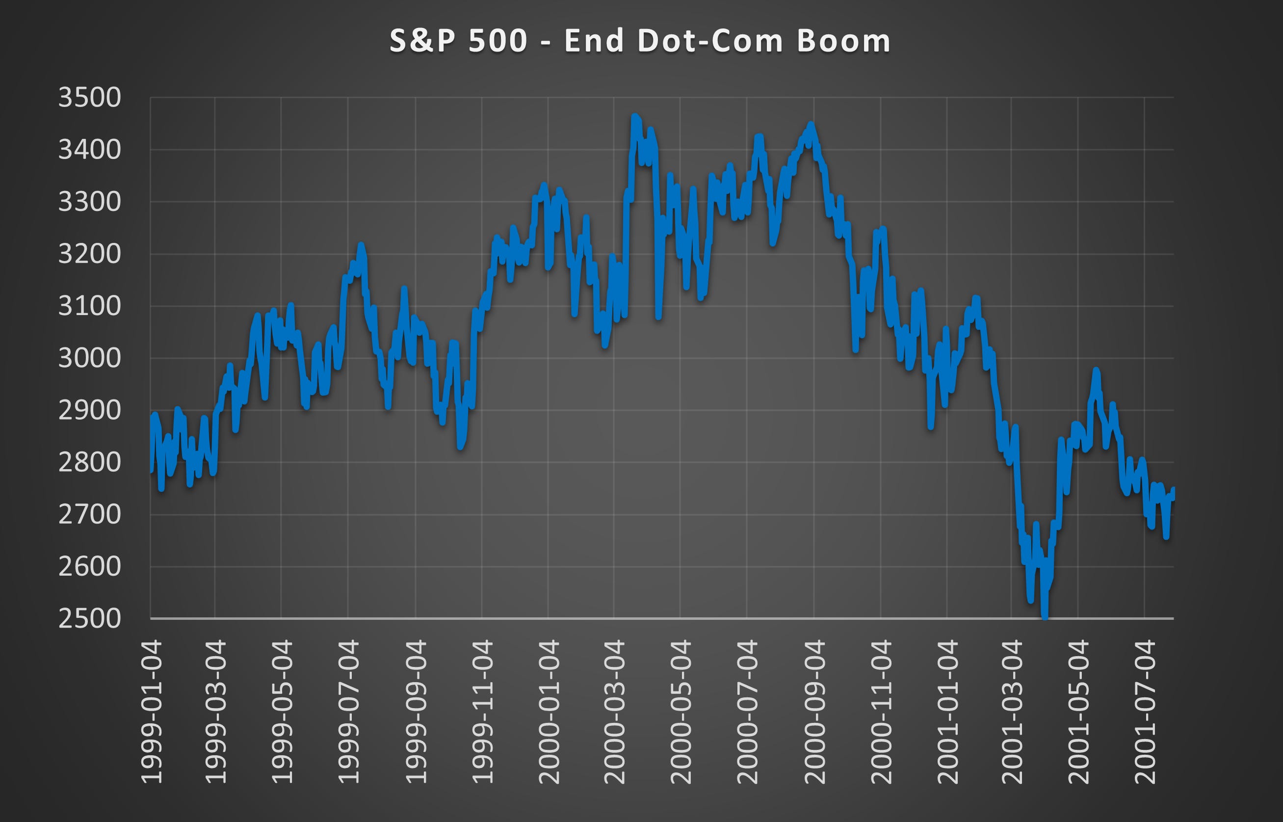
(Above) The market continued to rise throughout 1999 and most of 2000 before finally turning over in September 2000.
Dot-Com Bust = Collapsed Distributions
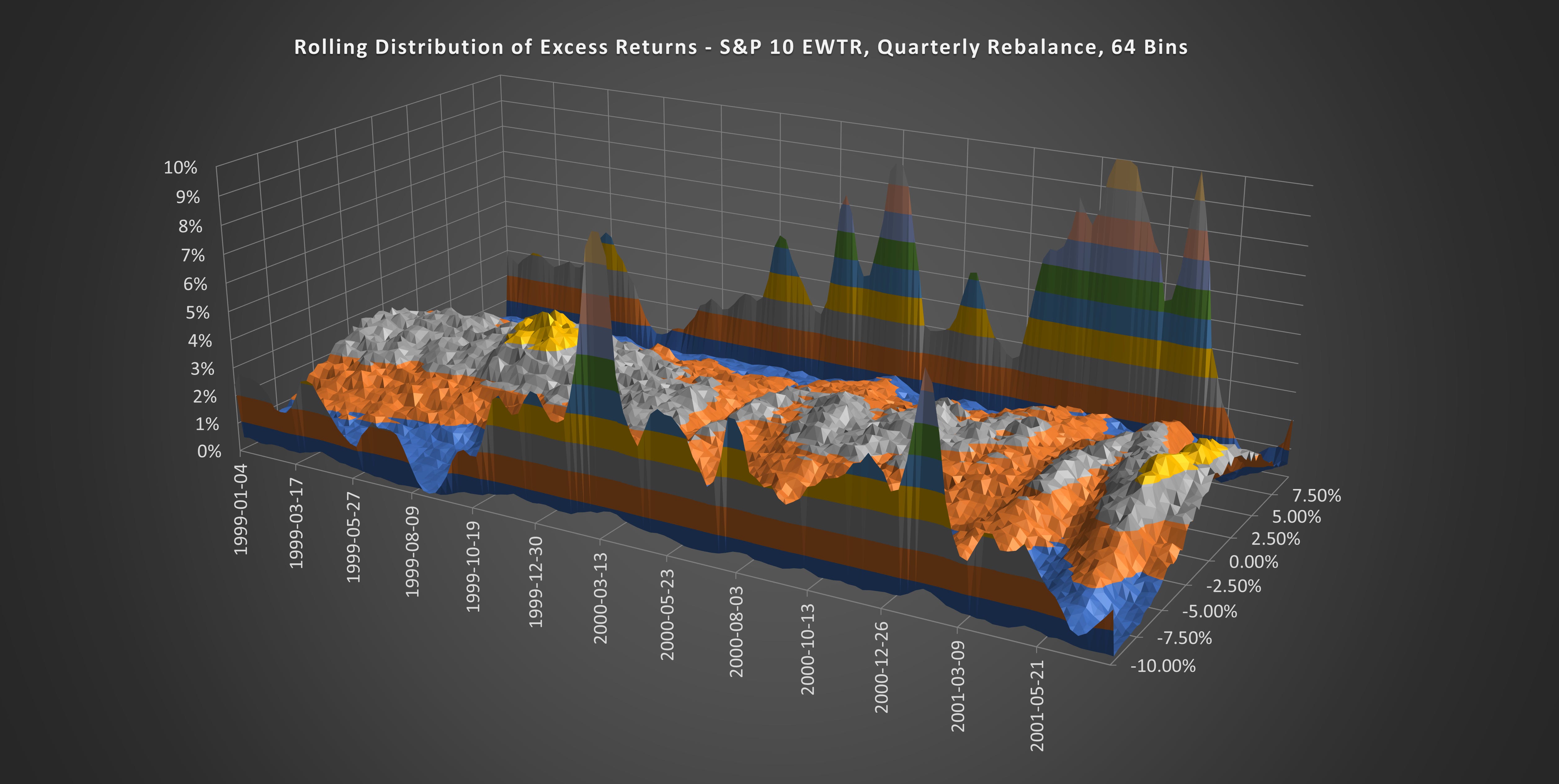
(Above) Long before the market failed, the distributions had already collapsed. This was a screaming warning sign that the bull market was already over. While that wasn’t obvious from the price action, it certainly was from the index components.
1987 Crash
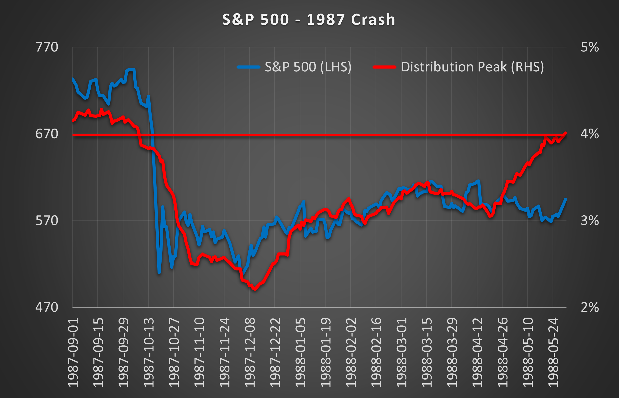
(Above) The 1987 crash wasn’t the start of a bear market. It was a sudden and unprecedented market dislocation. This chart shows the price action for the S&P 500 (Blue, left-hand side) and the distribution peak (Red, right-hand side). Notice how the distribution peak fell below 4% prior to the crash?
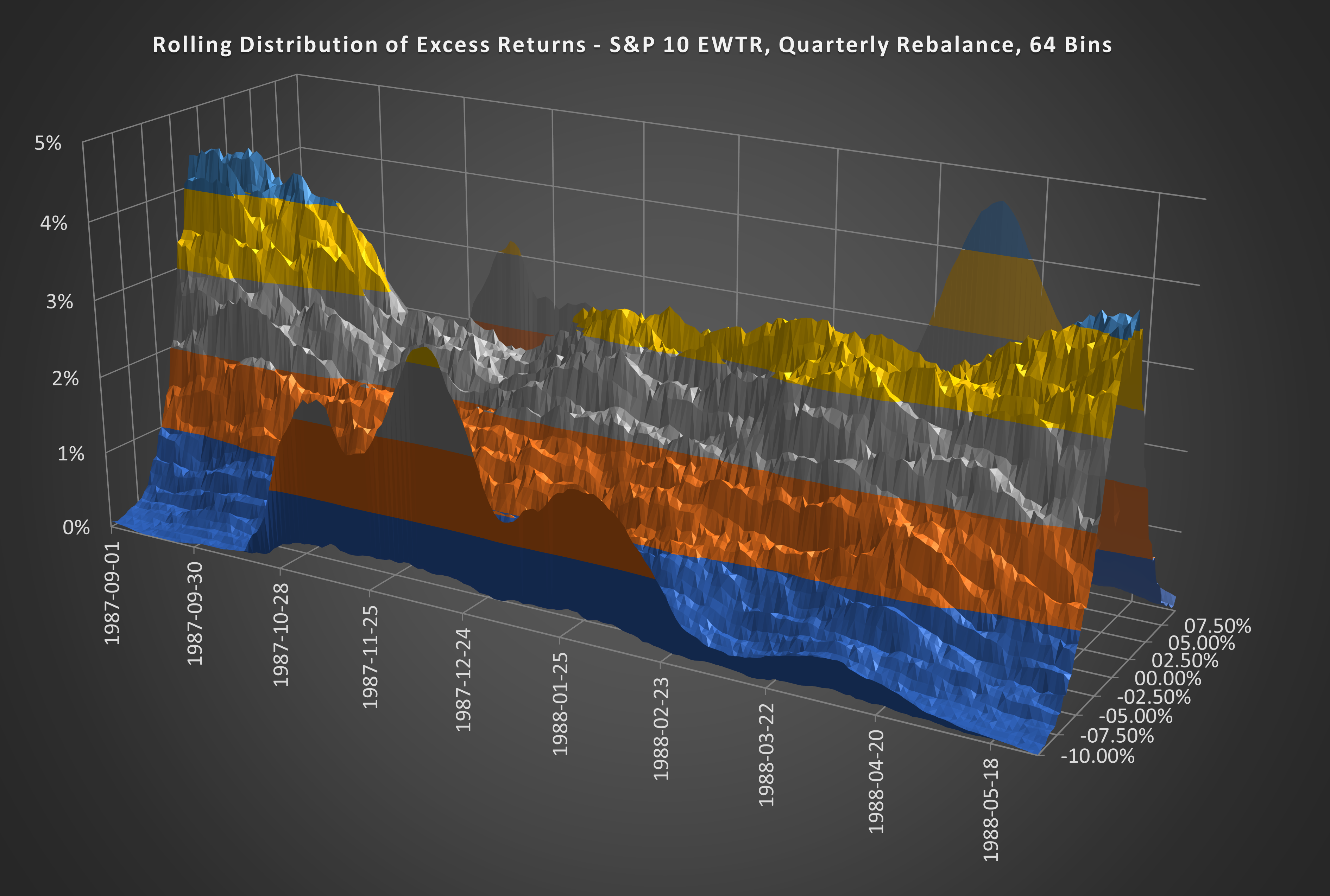
(Above) Here is the 3D version of the distribution curve through the 1987 crash and its aftermath.
Nifty 50
Nifty 50 Expansion = Bull Market
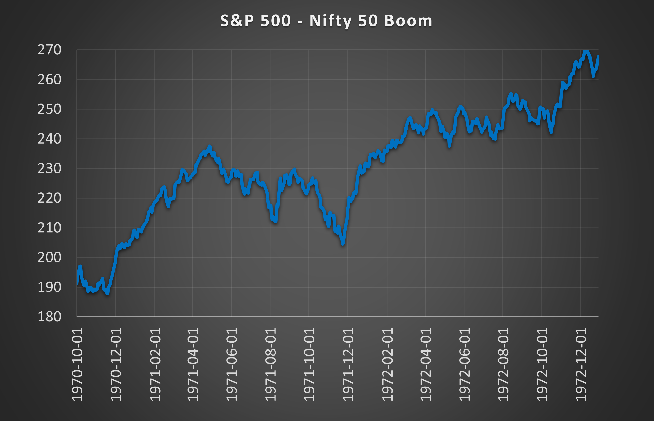
(Above) Here you can see the Nifty 50 boom in its heyday.
Nifty 50 Expansion = Peaked Distributions
(Above) The outcome distributions during this period were not as tightly peaked as the bull markets of the Dot-Com Boom or the Credit Boom. Although, this was a time when active managers ruled and trading was analog. A time before index funds and ETFs consumed the market. Around 9.0% of capital flowed through stocks where the price was unchanged on the day (in modern times it has fallen to ~0.20%). So it makes sense that the outcome distributions were more dispersed.
Nifty 50 Crash = Bear Market
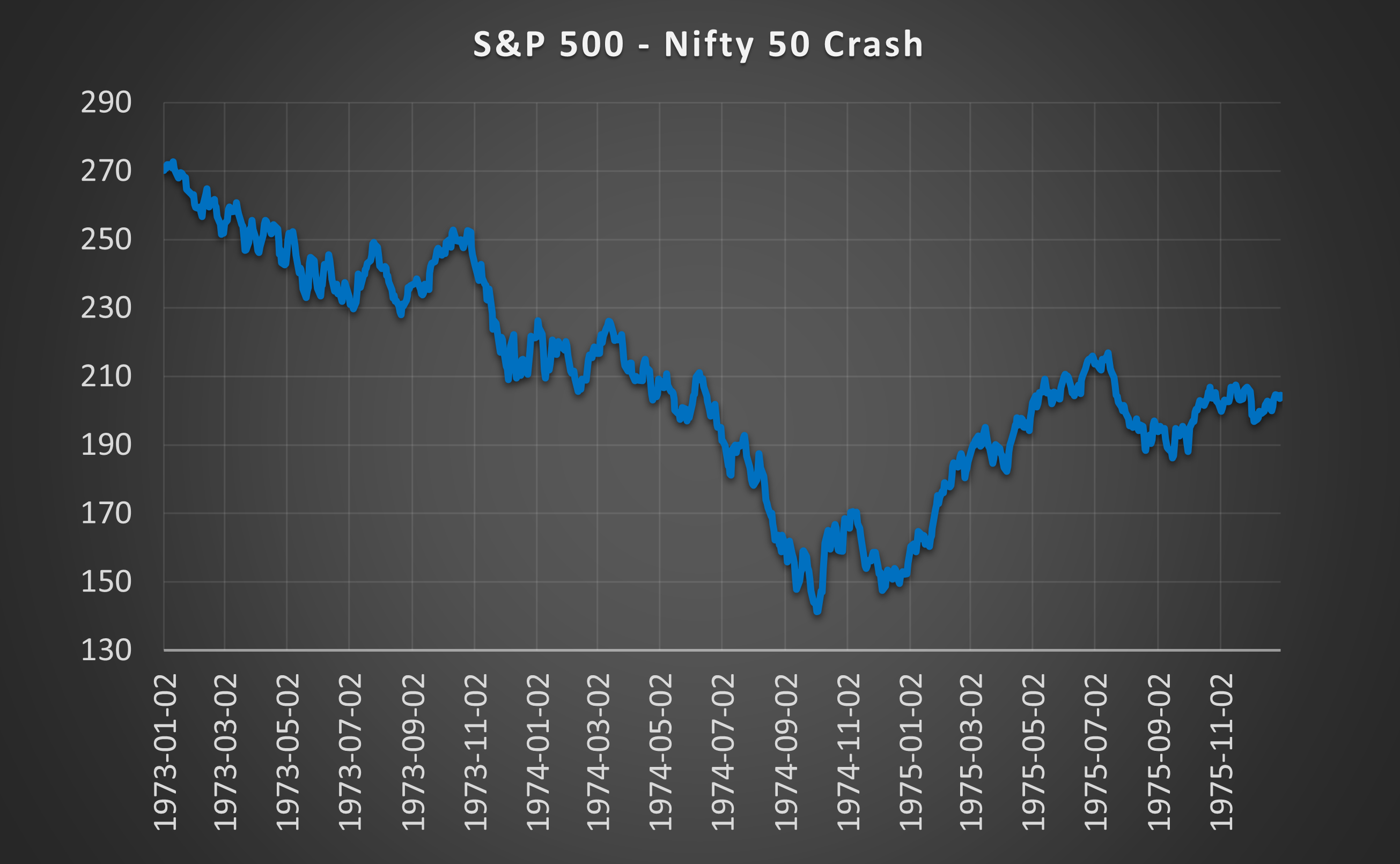
(Above) Pretty much 2 years of down only from 1973 when the Nifty 50 era came to an end.
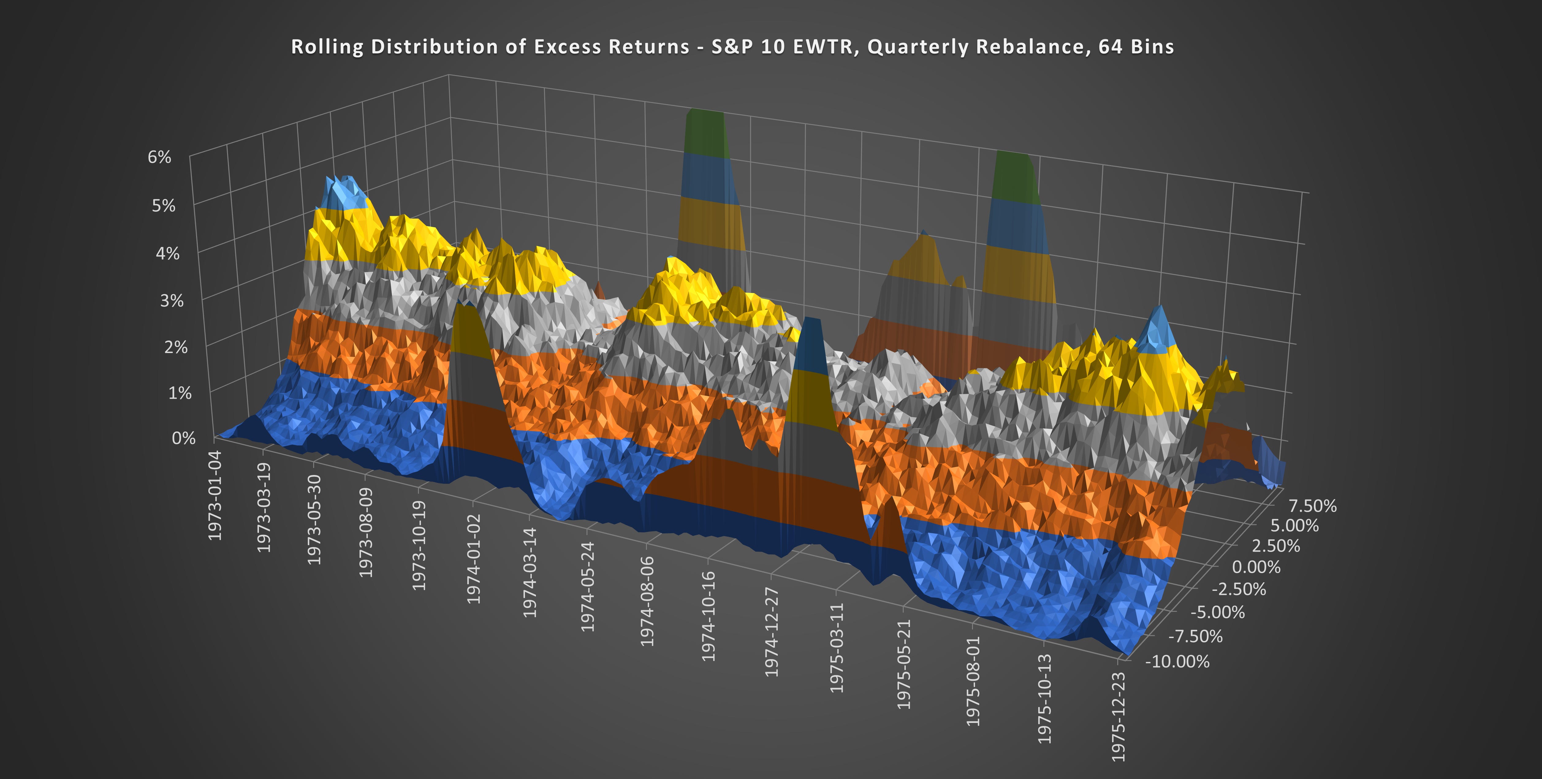
(Above) While the distributions did fall below 4%, partially collapse, and exhibit some large fat tails, they didn’t flatten to the extent we saw in the Dot-Com Bust or the GFC. During this bear market, some stocks still performed well and there was room for exceptional managers to thrive. Bear markets of the modern era tend to drag everything down simultaneously.
Harmonic Shoal Trading Model
Harmony = Low Risk & Easy Profits
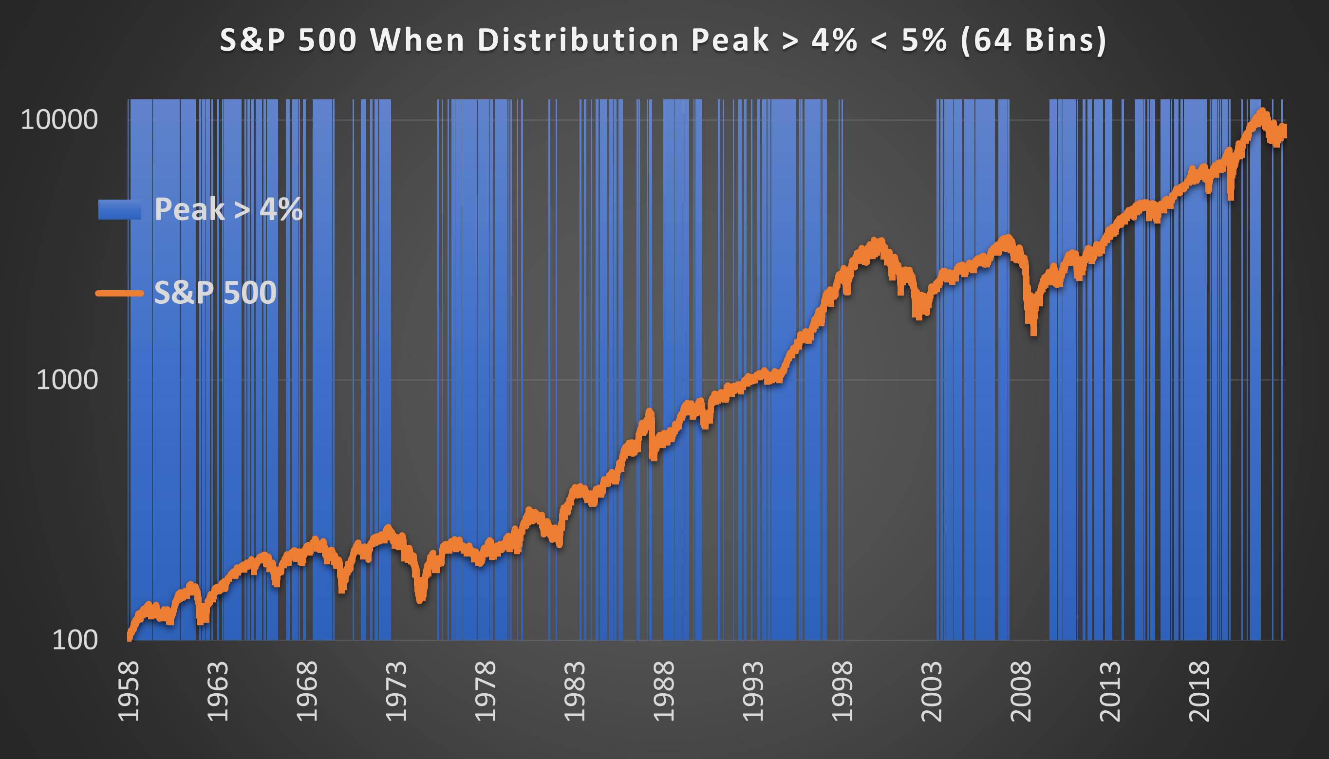
(Above) In blue are the periods when the distribution peak was between 4% & 5%. This is the Goldilocks zone; periods of harmony where the market obediently adheres to predictive models and is placidly bullish.
These periods represent 41.2% of market days but only 8% of the 4 Sigma down days. This means that extremely bearish days are underrepresented by 81% compared to the entire time series. AKA this is the 41.2% of the time when the low-stress money is made. Swim my little fish friends, swim!
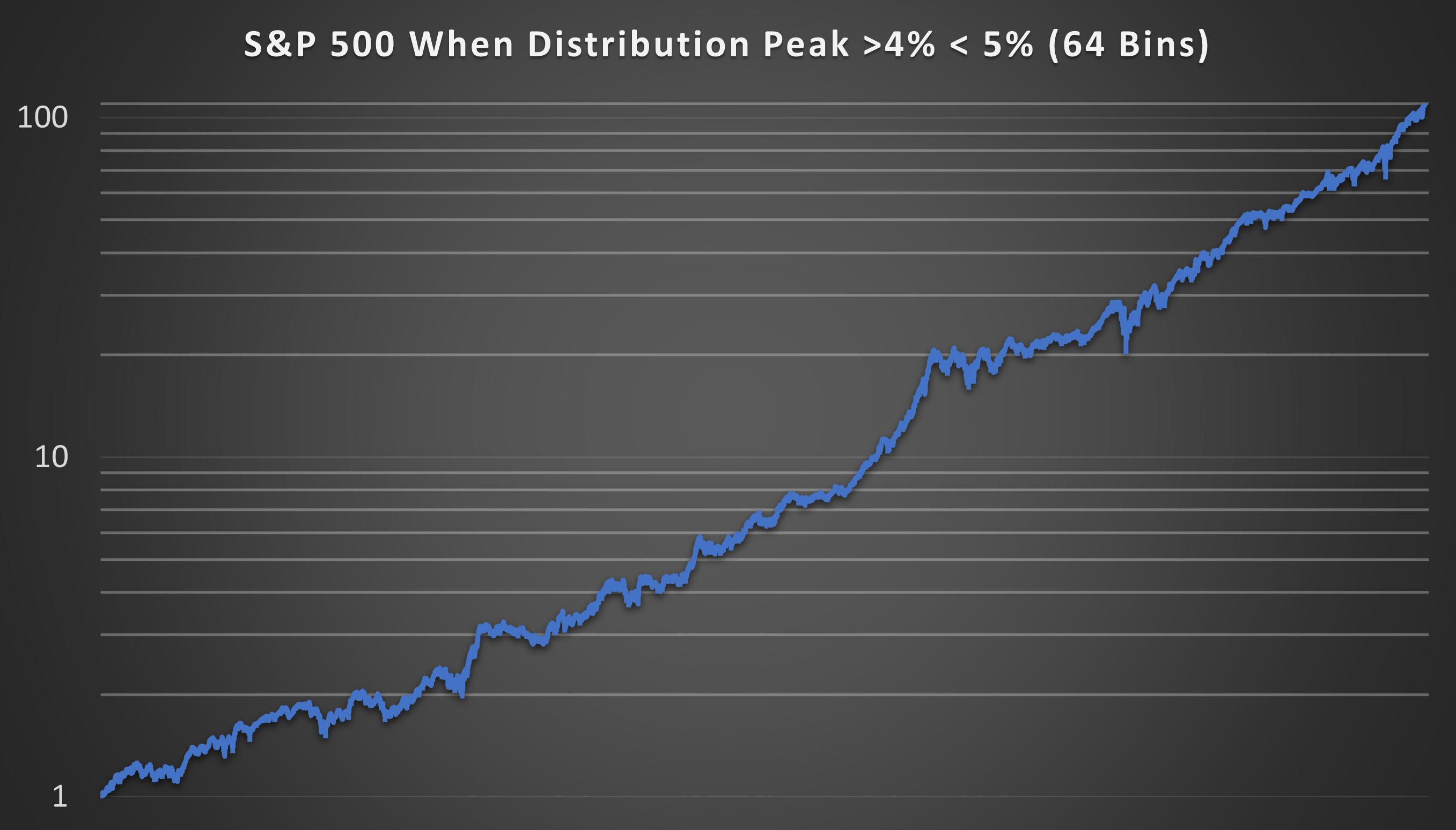
(Above) Here, on a log scale is the continuous equity curve from holding the S&P 500 only when the distribution peak is > 4% < 5%. Across 222 trades there is an average trade duration of 61 days, a win rate of 65%, an average profit of 5.14%, and an average loss of -2.87%.
The annualized Standard Deviation was just 11.7% vs 16.2% for the S&P 500. The CAGR was 15.09% vs 7.26% for the S&P 500.
Anarchy = High Risk & Violent Declines
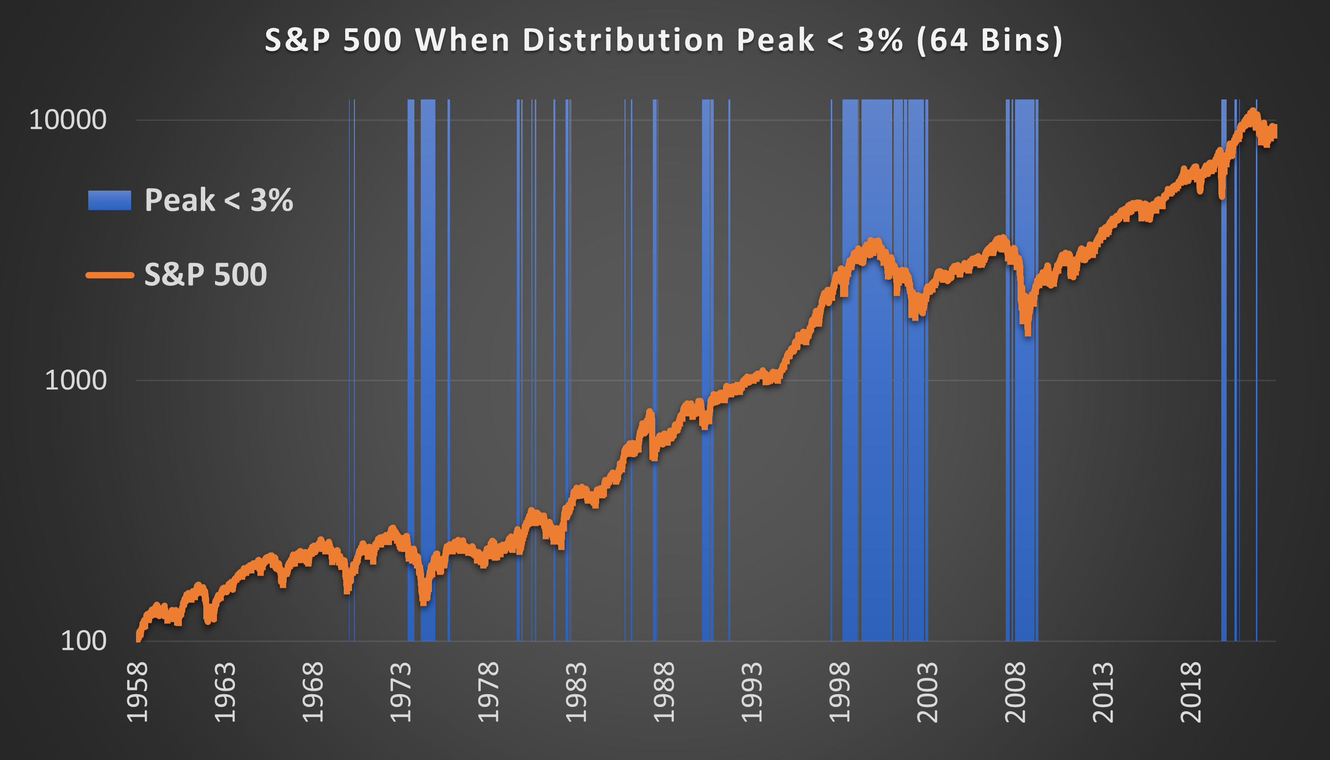
(Above) In blue are the periods when the distribution peak was below 3%. This is the danger zone where the market is least predictable and erratically bearish.
This period represents just 13.8% of market days but 64% of the 4 Sigma down days! This means that extremely bearish days are overrepresented by 365% compared to the entire time series. AKA this is the 13.8% of the time when stress levels are high. There is blood in the water and the fish are panicking.
Interestingly, this time also captures 60% of the 4 sigma UP days. But it doesn’t matter if you miss the best days, as long as you also miss the worst days!
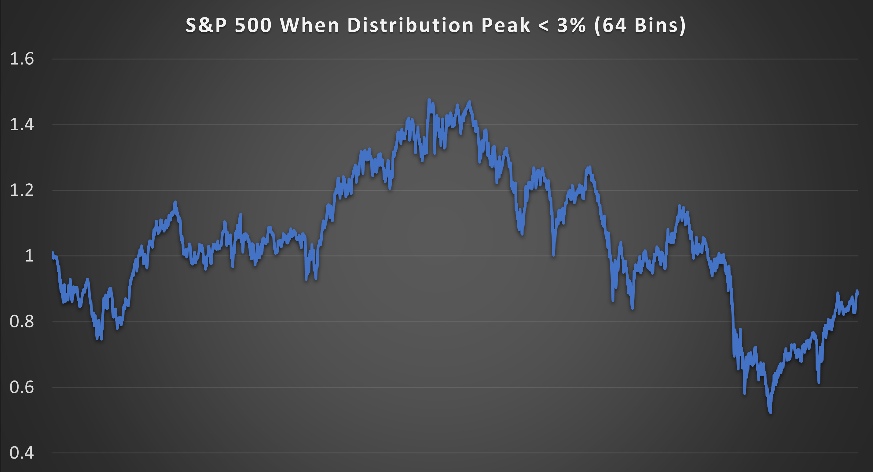
(Above) Here is the continuous equity curve from holding the S&P 500 only when the distribution peak has collapsed to below 3%. Across 48 trades there was an average trade duration of 70 days, a win rate of 49%, an average profit of 6.38%, and an average loss of -5.23%.
The Standard Deviation was a massive 26.5% vs 16.2% for the S&P 500. The CAGR was -0.92% vs 7.26% for the S&P 500.
Conclusion
Periodically financial markets send hundreds of PhD quants home in body bags.
The most classic example of this was Long-Term Capital Management (LTCM) which was founded in 1994 by Myron Scholes (of Black-Scholes fame) and a team of Nobel laureates. It was hailed as “too smart to fail” due to its use of complex mathematical models.
But, a collapse in outcome distributions like the ones presented in this article led to catastrophic losses for LTCM. More smart people, more body bags.
It is important to understand that the market can and will behave in ways that simply don’t fit any predictive model. But as I have demonstrated, these periods of anarchy can be measured by looking for a collapse in the distribution of outcomes.
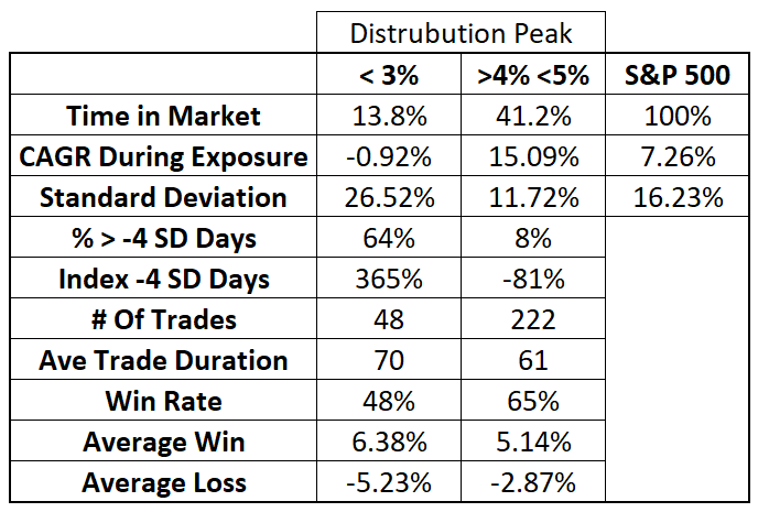
(Above) Here are the stats in a table for the Harmonic Shoal Trading Model. High risk periods (< 3%) and the low risk periods (> 4% < 5%). Have you ever seen a quantifiable way to identify times that over and under represent risk so dramatically?
Do you find this research valuable?
If so and if you want to see more, here’s how you can support:
Like this article to show your appreciation.
Comment with your thoughts and questions; I’d love to hear from you.
Subscribe for exclusive insights and updates.
Share this article with fellow investors who could benefit from this knowledge.
Your support will keep me motivated to continue providing unique, in-depth research. Thank you!
Further Research
Quite frankly calculating these outcome distributions is a pain in the ass. Over 62 billion calculations went into the modeling in this article. When an outcome distribution collapses we are essentially saying that the spread of beta amongst S&P 500 components is widening. Perhaps there is an easier or better way to measure the same thing. More research into the distribution of correlation and beta needs to be done.
It also appears as though there is an element of predictability to volatility. I need to investigate how far forward, current volatility influences future volatility.
Questions for you dear reader (if you made it this far):
What are your observations from this research?
What would you like to see tested? (Dataset = S&P 500 Constituents 1957 - 2023 By Sector).
Thank you for the post. It stands out from what one usually sees on Substack. I'd even say this research paper belongs to SSRN or arXiv.
You haven't mentioned what happens when distribution peak reaches values >5%. From a 3D chart in an explanatory post for the whole period covered it seems like these periods aren't that rare. My guess is that those periods aren't that good for being long market. Intuitively it feels like buying near the very top. But that's just an assumption. I'll get back once I have it tested.
Once again - great work!
Is there a way to detect peaking and collapsing distribution without doing the mind boggling amount of number crunching that went into the data you presented here? Any useful proxies you’ve found?